Performance Indicator Columns
The project list offers two kinds of performance columns that let you judge project health without opening a single project:
- Traffic-light performance indicators answer the question "where does this project stand right now?" — they compare actual values against planned values and show the result as a green, orange, or red signal.
- KPI trend sparklines answer the question "where is this project heading?" — they plot the daily history of a value as a small chart inside the table cell.
Both types are added to the list the same way, via Choose columns, and both are calculated automatically from the data entered in the project.
Traffic-Light Performance Indicators
Traffic-light columns use green, orange, and red to visualize whether key project values are within, slightly above, or significantly above their planned targets.
The performance indicator columns are:
- Cost performance
- Progress performance
- Resource cost performance
- Revenue performance
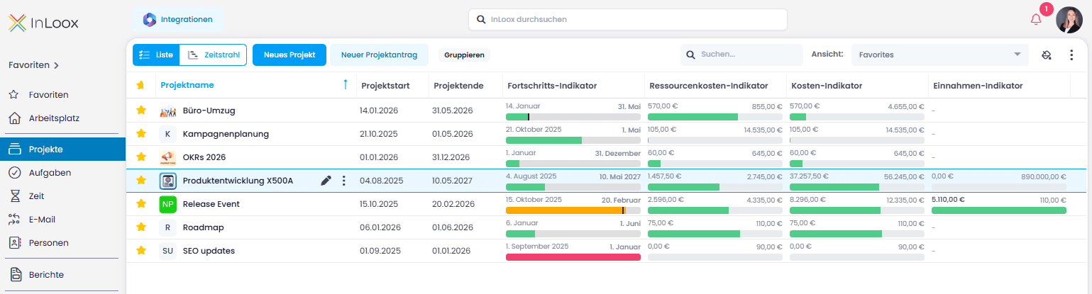
Display and Save Performance Columns
- Click in the upper right corner (or right-click a column header) and select Choose columns.
- Choose the performance columns you need, or search for "performance."
- Drag the selected columns into the list.
- To remove a column, drag it out and release.
- If you accidentally remove a column, click the undo button in the green bar at the lower left.
- To save this view, click and select Save as New View.
- Name the view (e.g., "Project performance view") and click Save.
Cost Performance
What it shows: Compares actual project costs with planned project costs.
- 🟢 Green: Actual costs are below planned costs
- 🟠 Orange: Actual costs exceed planned costs by 0.01%–5%
- 🔴 Red: Actual costs exceed planned costs by more than 5.01%
Required data: Planned project expenses (CapEx or OpEx) and actual project expenses (CapEx or OpEx). For more information on project finances, see the help article on financials.
Progress Performance
What it shows: Evaluates whether the remaining project duration is sufficient to complete the effort of overdue tasks.
- 🟢 Green: Overdue task effort can be completed within the remaining time
- 🟠 Orange: Overdue task effort exceeds remaining time by 0.01%–5%
- 🔴 Red: Overdue task effort exceeds remaining time by more than 5.01%
Required data: Project start date, project end date, task effort, and task due dates. To ensure accurate results, planned effort must be maintained in the tasks and task due dates must be set.
Resource Cost Performance
What it shows: Compares recorded effort from time tracking with planned effort from tasks.
- 🟢 Green: Recorded effort is at or below planned effort
- 🟠 Orange: Recorded effort exceeds planned effort by 0.01%–5%
- 🔴 Red: Recorded effort exceeds planned effort by more than 5.01%
Required data: Planned effort from project tasks and actual effort recorded via time tracking. Without both values, this indicator cannot display a meaningful result.
Revenue Performance
What it shows: Compares actual revenue with planned revenue.
- 🟢 Green: Actual revenue is higher than planned revenue
- 🟠 Orange: Actual revenue equals planned revenue
- 🔴 Red: Actual revenue is lower than planned revenue
Required data: Planned benefits and actual benefits from project financials.
By maintaining complete and up-to-date financial, scheduling, and effort data, the performance indicator columns provide an immediate visual overview of project health.
KPI Trend Sparklines
A sparkline is a small line chart shown inside the table cell, without axes or labels. Where a traffic light condenses the current state into one signal, a sparkline shows the development that led to it — so you can read the direction of travel at a glance.
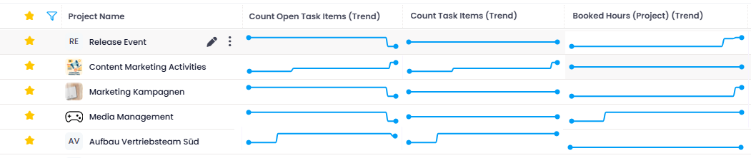
Example: Two projects both show 80% in the Progress (Auto) column. The sparkline reveals that the first project climbed steadily to 80%, while the second reached 75% two months ago and has been flat ever since. Same number, very different situation — and only the second one needs your attention.
The trend behind each sparkline comes from the daily KPI history that InLoox records for every active project. By default, the sparkline covers the last 90 days. InLoox has been recording this history since version 26.5 (InLoox Cloud: since 19.08.2026); older values are not available.
Available sparkline columns include costs, revenues, profit, margin, progress, effort, tasks (open and done), and risk count. InLoox also records the history of project custom fields. For the full list of project columns, see the overview of columns in list views.
Enabling Sparkline Columns
- Hover over an existing column header and click on its right edge. The Choose Columns window opens.
- Search for the column you want. Sparkline columns have (Trend) after their name. Tip: Search for Trend to see all available sparkline columns.
- Turn on the toggle next to the sparkline column you want to show.
- To save this view, click the three dots and select Save as New View.
Sparkline columns are available in the InLoox Enterprise, InLoox Enterprise Plus, and InLoox Self-Hosted editions and require the Read Historic Data permission (enabled by default). See Permissions for details. Historical KPI values are recorded once per night, so a newly created project shows a sparkline only after the first nightly run.
The same KPI history is available as trend widgets on the project dashboard, and via the Project KPI Snapshots API for your own reporting.