Dashboard Layout
This section describes the features related to the dashboard layout.
Dashboard Width and Height
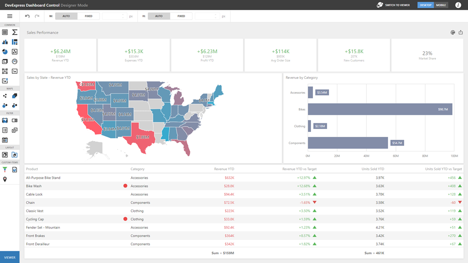
The control automatically stretches or shrinks content (dashboard items) in a dashboard to fit available screen space horizontally and vertically. You can adjust layout options and specify exact content width and height.
As an alternative, you can set content size in pixels. If the width or height is too large, the Dashboard control displays a scrollbar.
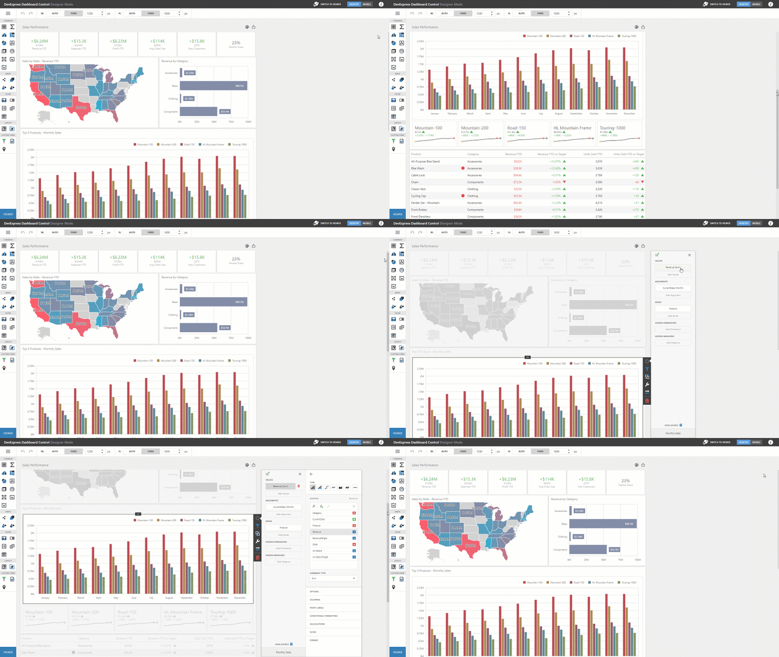
Specify the following options in the Designer Toolbar:
-
Auto
The height or width of a dashboard surface fits to content.
-
Fixed
The height or width of a dashboard surface is set in pixels.
Dashboard Title
The Dashboard Title is at the top of the dashboard surface and can contain static text, svg images, and command buttons. These elements are called toolbar items:
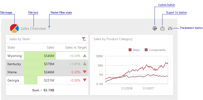
Refer to the following article for details: Dashboard Title.
Dashboard Items Layout
The dashboard arranges dashboard items and groups using layout items and layout groups. They are containers that display a dashboard layout as a hierarchical structure.

See the following article for more information: Dashboard Items Layout.
Dashboard Item Caption
Each dashboard item has a caption that is displayed at the top of this item. The caption can contain static text, svg images, and command buttons. These elements are called toolbar items:
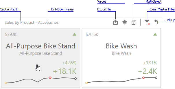
See the following article for more information: Dashboard Item Caption.