Accessibility Settings
You can adapt the appearance and behavior of InLoox to your needs. These settings are personal: they are stored in your user profile and do not change InLoox for other users. All options are off by default, so they do not change the standard design unless you enable them.
- In InLoox, click your profile picture in the upper-right corner.
- Click Account Settings.
- Click Personal.
- Under Accessibility, turn on the options you want to use. Every option takes effect immediately.
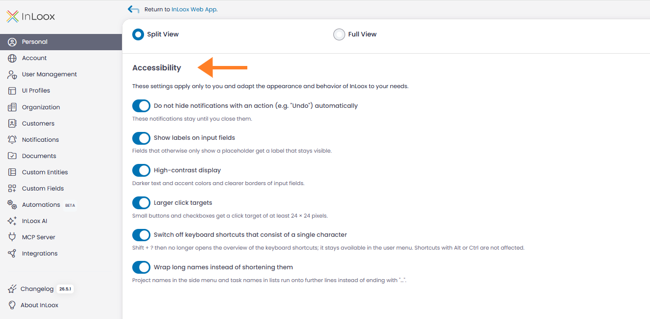
Available options
- Do not hide notifications with an action (e.g. "Undo") automatically — Notifications that include an action stay visible until you close them.
- Show labels on input fields — Fields that otherwise only show a placeholder get a label that stays visible.
- High-contrast display — Uses darker text and accent colors and clearer borders of input fields.
- Larger click targets — Small buttons and check boxes get a click target of at least 24 × 24 pixels.
- Switch off keyboard shortcuts that consist of a single character — Shift + ? no longer opens the overview of the keyboard shortcuts; the overview stays available in the user menu. Shortcuts with Alt or Ctrl are not affected.
- Wrap long names instead of shortening them — Project names in the side menu and task names in lists wrap onto further lines instead of ending with "…".
Each option is saved as soon as you switch it and applies in every browser and on every device you sign in with.
Zoom and narrow windows
These adjustments are active for everyone and need no option:
- Toolbars, filters, and banners wrap into additional rows as soon as a view is narrower than 640 pixels — in a narrow window or at a high browser zoom such as 200%. Nothing is cut off.
- In a split view, the detail appears above the list when the area is narrower than 640 pixels, so you do not have to scroll horizontally.
- On an iPhone, you can pinch to zoom in the InLoox Web App just as you do on any other website.
Tooltips
Tooltips — the short info texts on icons and buttons — behave as follows:
- They open when you rest the pointer on a control and stay open while you move the pointer onto the tooltip.
- They also open when you reach the control with the keyboard, for example with Tab, and close when the control loses the focus.
- Esc closes an open tooltip.
Keyboard and screen reader support
InLoox controls can be operated with the keyboard. Input fields expose their labels and their required or invalid state to assistive technology, so screen readers announce whether a field is required and whether a value is invalid, and read out the error text as soon as it appears. Dialogs and drawers manage focus and can be closed with Esc. To unpin a focused project tab, press Del.
For an overview of all keyboard shortcuts, see Shortcuts.